In the ever-evolving world of web design, staying ahead of the curve is crucial. As technology advances and user expectations grow, developers and designers are constantly seeking new tools and techniques to create stunning, responsive websites efficiently. Enter Tailwind CSS, a utility-first CSS framework that’s taking the web design community by storm. In this blog post, we’ll take a look at how Tailwind CSS is revolutionizing the way we build websites and why it’s become the secret sauce of modern web design.
What is Tailwind CSS?
Tailwind CSS is a highly customizable, low-level CSS framework that provides a set of utility classes to build custom designs quickly and easily. Unlike traditional CSS frameworks that come with pre-designed components, Tailwind CSS focuses on giving developers the building blocks to create unique designs without writing custom CSS from scratch.
The Philosophy Behind Tailwind
The core philosophy of Tailwind CSS is to provide a set of primitive utility classes that can be combined to create any design. This approach allows for maximum flexibility and creativity while maintaining consistency across projects. By using these utility classes, developers can rapidly prototype and iterate on designs without the need for writing custom CSS for every element.
The Benefits of Using Tailwind CSS
1. Rapid Development
One of the most significant advantages of Tailwind CSS is the speed at which developers can build and prototype websites. With a comprehensive set of utility classes at their fingertips, designers and developers can quickly experiment with different layouts, colors, and styles without writing custom CSS.
2. Consistency and Maintainability
Tailwind CSS promotes consistency across projects by providing a standardized set of classes. This consistency makes it easier for teams to collaborate and maintain code over time. Additionally, because styles are applied directly in the HTML, it’s easier to understand and modify the design without digging through separate CSS files.
3. Responsive Design Made Easy
Creating responsive designs is a breeze with Tailwind CSS. The framework includes built-in responsive modifiers that allow developers to apply different styles based on screen size. This feature eliminates the need for complex media queries and makes it simple to create mobile-first designs.
4. Customization and Flexibility
While Tailwind CSS provides a set of default utility classes, it’s highly customizable. Developers can easily modify the default configuration to match their project’s design system, including colors, spacing, and breakpoints. This flexibility allows teams to create a unique look and feel while still benefiting from the framework’s utility-first approach.
How Tailwind CSS Differs from Traditional CSS Frameworks
Breaking Away from Pre-designed Components
Traditional CSS frameworks like Bootstrap or Foundation come with pre-designed components that often lead to websites looking similar. Tailwind CSS takes a different approach by providing low-level utility classes that can be combined to create unique designs. This approach gives designers more control over the final look and feel of their websites.
Reducing CSS Bloat
One common issue with traditional CSS frameworks is the amount of unused CSS that gets shipped to the browser. Tailwind CSS addresses this problem by allowing developers to purge unused styles during the build process, resulting in significantly smaller file sizes and faster load times.
Tailwind CSS in Action: Real-World Examples
To better understand how Tailwind CSS is revolutionizing web design, let’s look at some real-world examples of how it can be used to create common UI components.
Creating a Responsive Navigation Bar

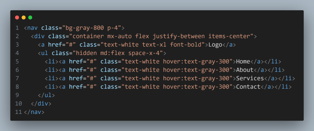
In this example, we’ve created a responsive navigation bar using Tailwind CSS utility classes. The hidden md:flex classes ensure that the navigation links are hidden on mobile devices and displayed on medium-sized screens and above.
Designing a Call-to-Action Button

This simple button example showcases how easy it is to create an attractive, interactive element using Tailwind CSS. The utility classes handle everything from the background color and text styling to hover effects and transitions.
Tailwind CSS Best Practices and Tips
To make the most of Tailwind CSS in your web design projects, consider the following best practices and tips:
- Use the official documentation: Tailwind CSS has extensive documentation that covers all aspects of the framework. Make it your go-to resource for learning and troubleshooting.
- Leverage Tailwind’s configuration file: Customize the default configuration to match your project’s design system and improve consistency across your website.
- Utilize Tailwind’s @apply directive: For frequently used combinations of utility classes, use the @apply directive in your CSS to create reusable component classes.
- Optimize for production: Use Tailwind’s built-in purging feature to remove unused styles and minimize your CSS file size for production.
- Combine with other tools: Tailwind CSS works well with popular JavaScript frameworks like React, Vue, and Angular. Explore integrations to enhance your development workflow.
The Future of Web Design with Tailwind CSS
As Tailwind CSS continues to gain popularity, it’s clear that it’s not just a passing trend but a significant shift in how we approach web design. The framework’s utility-first approach and flexibility make it an excellent choice for both small projects and large-scale applications.
Evolving with the Community
One of the strengths of Tailwind CSS is its active and growing community. As more developers adopt the framework, we can expect to see new plugins, extensions, and tools that further enhance its capabilities. This community-driven evolution ensures that Tailwind CSS will continue to adapt to the changing needs of web designers and developers.
Integration with Design Systems
As design systems become more prevalent in web development, Tailwind CSS is well-positioned to play a crucial role. Its customizable nature makes it easy to implement design tokens and maintain consistency across large-scale projects. We can expect to see more integration between Tailwind CSS and design system tools in the future.
Conclusion: Embracing the Tailwind CSS Revolution
Tailwind CSS has undoubtedly changed the game when it comes to modern web design. Its utility-first approach, flexibility, and focus on rapid development make it an invaluable tool for web designers and Frontend developers alike. By embracing Tailwind CSS, teams can create unique, responsive, and maintainable websites more efficiently than ever before.
As we look to the future of web design, it’s clear that Tailwind CSS will continue to play a significant role in shaping how we build websites. Whether you’re a seasoned developer or just starting your web design journey, exploring Tailwind CSS is a worthwhile investment that can revolutionize your workflow and unleash your creativity.
So, are you ready to take a dive into Tailwind CSS and discover the secret sauce of modern web design? Give it a try on your next project, and experience firsthand how this innovative framework is transforming the way we build websites.


